
Mobile Landing Page: Everything You Need to Know in 2024!


With mobile marketing increasing by the second, having a fast-loading, spiffy-designed mobile landing page is a sure-fire way to get the crowd’s attention.
The number of smartphone subscriptions already surpasses 6 billion and is expected to keep growing even more.
That tiny handheld mobile device is where you can find your new customers hanging out!
Having a landing page specifically designed for mobile devices is a must.
Let’s dive into the world of great mobile landing pages!
What Is a Landing Page
A landing page is any page a viewer can land on after clicking on, for example, an email link, Facebook — or any other social media advertisement.
In general, it’s a single web page designed to convert visitors into leads and ultimately into buying customers.
Look at a landing page as a trade; you provide information, present a service, or give a special offer, and the visitor fills out their email address in return.
Or, even better, fills up their cart with your product!
As you can imagine, too much information may spook them out.
Landing page visitors don’t show up to read your novel about how it all started.
Landing page visitors clicked an ad or whatever, and they expect you to deliver what you promised in the ad. Nothing more.
The average time spent on a page is 10-20 seconds.
If your unique value proposition isn’t appealing or straightforward within 10 seconds of scanning the page, your visitor will bounce and search for the next best.
Why Create a Mobile Landing Page

Have you ever clicked on an ad, only to find the landing page wasn’t loading correctly, the mismatching images were giving you a headache, and you could not find the info you expected?
Aargh, the frustration!
Desktop-designed landing pages that are mobile responsive still lack the proper layout for mobile.
Desktop pages generally contain more information simply because it fits.
However, that same information crammed into a single column, or weirdly compressed, just looks dumb.
Even though overall computer usage is still increasing, mobile usage calls the shots.
Mobile statistics show that mobile use dominates the online world, and time spent on a mobile phone is about to exceed the time spent watching television.
Imagine that!
Don’t you want a portion of those iPhone diehards? Or to reel in the Android obsessed? Aren’t you dying to turn a potential customer into a loyal customer?
Then you need to focus on mobile landing page optimization with a simple design, minimal copy, easy navigation, and fast loading time — and mobile shoppers become your best friend.
Best Practices For Designing a Mobile Landing Page
There are some best practices you should adhere to when creating your mobile landing page template.
1. Design a separate landing page specifically for mobile
Don’t assume you’ll get away with the desktop view of your landing page.
A mobile digital marketing campaign is a whole different sport since mobile users browse and scroll differently than desktop users.
A mobile-responsive design is just squeezing your web content onto a smaller screen, which doesn’t entirely create a jubilant mobile user experience.
Map out your customer’s journey, determine the mobile devices they use, and customize the mobile version of your landing page accordingly.
2. Your first priority is your call to action button
Your landing page looks all spiffy, and the sales funnel behind it is ready to receive all the traffic. Only, there is hardly any mobile traffic coming through.
The disruptor here is most likely your Call To Action button. Or maybe even a complete lack thereof.
When landing on your page, the human psyche expects to see a CTA, whether visitors ultimately click on it or not.
It’s the most crucial element of your mobile app landing page.
Make the CTA button compelling, clear, concise, and impossible to ignore.
Here’s a great article on the psychology behind the CTA.
3. Add a click-to-call button

Mobile visitors already have their smartphones at hand, so why not make it easy for them to connect with you instantly.
By offering real-time communication with — for example — a customer service agent, your chances for a higher conversion goal go up.
Another way the click-to-call button works is to make it a callback, where the prospect can leave their details to be called back at a time that suits them best.
4. Use click-to-scroll
Sometimes it may be necessary or desirable to provide extra information. Resist the temptation to cram it all into your mobile landing page.
Consider implementing click-to-scroll navigation buttons that direct viewers to a more extended landing page.
Ideas for these buttons include inventory, operating hours, directions, or general company and product info.
5. Utilize sticky navigation
Sticky navigation means that menu items, such as the CTA button or chat function, remain visible as visitors scroll down.
Pros:
- Quick and easy navigation
- Visible reminder
- Clear branding
Cons:
- Takes up space
- Constant distraction
Sticky navigation may trigger a sense of calm in your visitors; they’re never lost as navigation follows them around and remains at their disposal at all times.
6. Optimize popups for mobile
Popups — a much-debated feature for landing pages.
Some say they don’t belong on mobile pages but don’t write them off just yet.
Popups may lead to increased conversions, but with one caveat, they only work when appropriately designed and optimized for the mobile experience!
A few things to keep in mind:
- It should not interrupt the user’s reading experience
- A popup must be easy to dismiss
- Keep it clean and simple — limit the fields to fill in or (even better) go for just an email address
7. Trim the fat from your headlines

Snap your fingers.
Done?
That’s precisely the time readers need to decide whether they care enough to keep reading or bounce off.
The magic of retained attention lies in a well-crafted headline, not only in regular web copy but even more so on effective mobile landing pages.
A mobile headline’s perfect length is six words max, but four is even better.
It’s the headline that draws in the prospects, so if you're not the king-of-copy, hire someone who is.
8. Keep your content short and sweet
When crafting content for mobile landing pages, always think less is more.
Remember, mobile visitors are just skimming your text. And TMI (Too Much Info) won’t be read.
Here are a few tips:
- Use bullet points (draws in the attention)
- Trim down paragraphs
- Cut out any unnecessary wording
- Stick to the bare minimum of essential information
9. Whoa — take it easy on videos and visual
Having the right visuals on your mobile landing page could trigger visitors’ emotions to click your CTA button and boost your conversion.
Nonetheless, don’t overdo it and restrict visuals and video to a minimum.
The more images and video, the more data it will cost your visitor, which may be a reason to exit your page.
Also, compress videos and images for a faster loading time.
10. Make sure your page loads lickety-split

Who has time for slow-loading mobile pages?
Speed is critical for smartphone users, and keeping your page’s load time under 3 seconds has a high impact on whether mobile visitors will stay or bounce.
Any additional second of loading will further plunge your conversion rate.
Some tips to optimize your loading speed include:
- Minimize visuals and video
- Compress and optimize images
- Reduce your content
- Embed your videos from a third-party platform, such as YouTube
11. Use a single-column layout
Skim reading seems to be the new normal, and if that’s what people want, then that’s what your page should provide.
A single-column layout supports this type of text scanning.
And probably even more important, mobile devices simply don’t do well on multiple columns, as used in web pages.
It makes scrolling inconvenient and the bounce rate higher.
A single-column layout is the best fit for mobile screens.
12. Optimize fillable forms for mobile
Exactly how much fun is it, having to fill out a surfeit number of fields on your tiny mobile screen?
Correct answer: not much.
Which is why mobile visitors may head for the hills when encountering your request for their life path.
It’s essential for mobile optimization that forms for mobile users only offer the bare minimum of fields to fill out.
Keep it short and sweet, minimize drop-downs, and make the submit button clearly visible.
13. Go for high contrast

Color can influence mood and capture a better attention level; therefore, it’s essential to choose your mobile landing page colors carefully.
Effective use of high color contrast will also enhance your page’s readability.
This is mainly for people reading your content on smaller screens, in bad lighting or sunlight conditions, or perhaps on lower-quality screens.
14. White space is your best friend
White space is not about the color white but refers to the empty space on a page.
The use of white space brings peace and calm to your mobile landing page, gives it a modern look and feel, and draws the reader’s focus to the essential page elements (such as your CTA button!)
Remove all the fluff and enhance your visitor’s touch screen interactions.
15. Keep your best stuff “above the fold”
You know what they say, right? Humans have an attention span equivalent to that of a goldfish, which is about five seconds.
You must avoid overloading your visitors with seemingly irrelevant information.
Cut to the chase already in your opening statement!
Above the fold is content ‘at first sight’ and must be designed to hook your reader in the second they land on your page.
You may quickly lose a visitor who needs to scroll for essential information.
16. Make sure you’re A/B testing
A/B testing is as simple as testing with two different versions of your landing page being shown to users at random.
This is a step you’d rather not skip!
When you split test your pages, you can compare the difference in performance.
A vital step if you want to maximize the conversion rate.
Marketing analytics tools will tell you which version brought in the most leads and where to make necessary adjustments.
Get Inspired With These Awesome Mobile Landing Page Examples
1. Geico

Geico is packing a punch with its simple yet effective and functional product landing page.
Geico knows mobile users want speed and simplicity with a clear CTA — start my quote — and minimal fields to fill in.
Everything they need is above the fold, and for those who are not convinced and start scrolling, a sticky friendly-face button follows them around.
2. Zoho

The mobile landing page for Zoho Cliq is a feast for the eyes. Use of colors, font, and layout is a pleasure to look at.
Nine words for the headline seems tricky, but in this case, it works well as the copy is clear and to the point.
And smack in the middle of the page, there are two buttons: Get Started and the App Store button for immediate mobile app download.
Sticky navigation at the bottom of the page that says Sign Up For Free.
What more info do you need?
3. Todoist
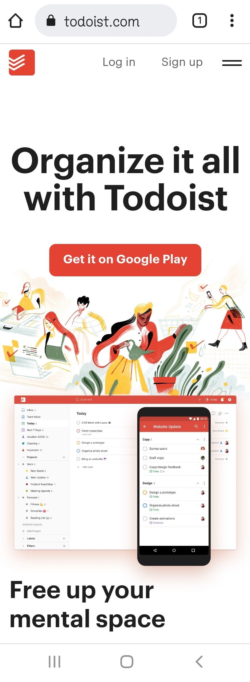
Impeccable high contrast, a killer 5-word headline, followed by a clear CTA ‘download on the app store’ button — and all surrounded by white space.
But that’s not all.
Below the fold, Todoist put down a few more brilliant headlines, some reviews, and at the bottom a repeated CTA.
4. Ace Hardware

Ace Hardware opens with a not-to-miss clear Shop Now button on a particular item.
Should it not be what you’re looking for, then one simple thumb movement brings you lower on the page, featuring other categories with clever mini headlines.
You can scroll rather far down where an abundance of CTA buttons like learn more, watch now or shop now all await your click.
5. ClaimCompass

ClaimCompass is a great example of a 3-word headline that doesn’t leave anything to the imagination and undoubtedly draws attention.
Then followed by a subhead that makes visitors excited to provide the requested CTA details without hesitation.
ClaimCompass uses a single-column layout, loads of white space, and the high contrast is on point.
The most essential content is above the fold, and a sticky chat icon follows your moves.
6. Mahabis Slippers
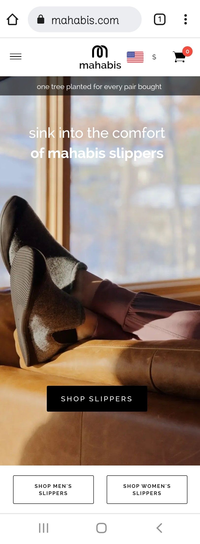
Mahabis Slippers’ opening is a slider, covering different goals. This could be a bit risky as it takes away the visitor’s desire for control.
However, the visuals are appealing, with attractive use of colors. And each slider image has a clear CTA button.
The 10% discount popup is a smart extra feature.
7. Jack Wolfskin
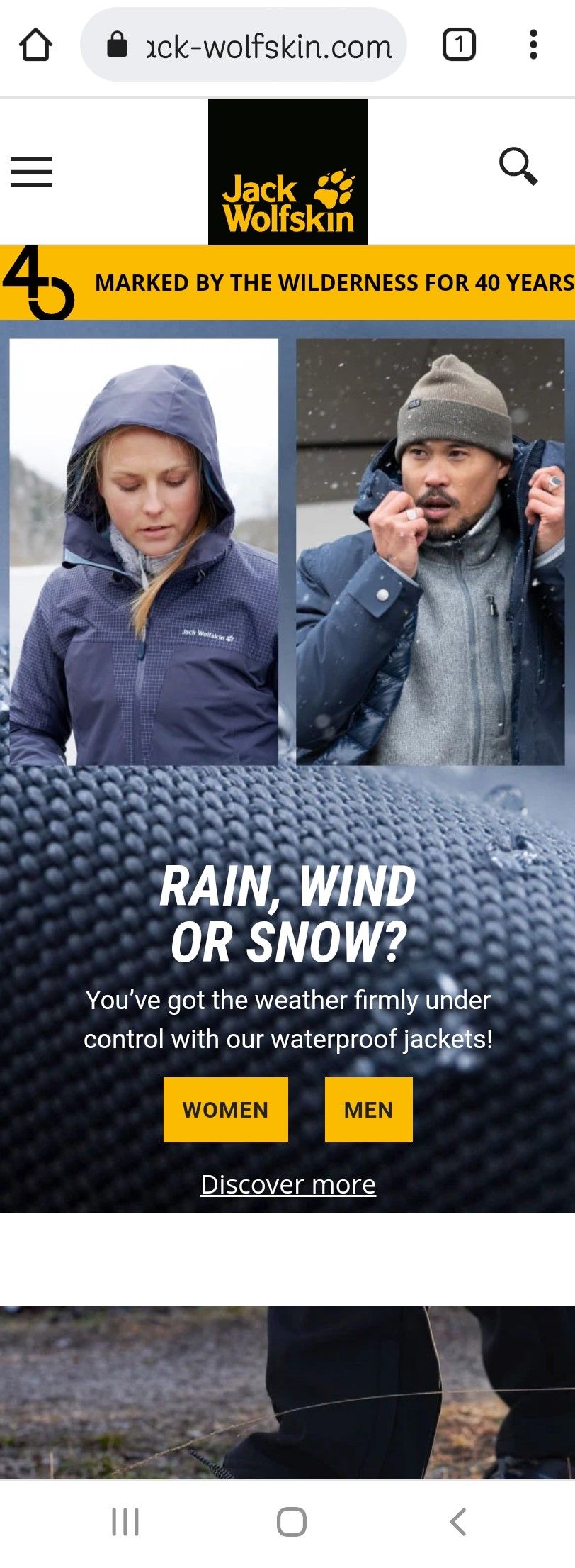
When landing on their page, imagery and headline make you see at a glance they play in the field of outdoor adventures.
And the first two CTA buttons above the fold are women and men, making it easy to dive straight in.
A subtle, clickable discover more button leads you directly to more info on the item they showcase on the landing page.
8. Country Chic Paint

What’s not to love about Country Chic Paint’s mobile landing page.
White spaces, soft colors, no unnecessary fluff, a headline that ticks all the boxes, and a paragraph with all the information you need.
Clicking the CTA — our colors — brings you to even more mesmerizing images.
9. Good Eggs

Good Eggs' landing page looks as fresh as their food.
Their opening statement is clear: “Delivering California’s best groceries and meals,” accompanied by a photo that triggers the senses on a calming white background.
Good Eggs makes excellent use of captivating images and short copy, both of which are crucial for mobile landing pages.
10. Promo

Promo is an online video maker, so it’s a no-brainer they use video marketing in their mobile landing page, which may cause load-time issues for mobile users.
They managed, however, to trim it all down, and their page loads fast enough to be enchanted immediately upon arrival.
Everything above the fold is spot on, and with only one finger swipe, they also show credibility with their partners’ trusted brand logos.
11. Helix

Mattress company Helix is smartly adapting its mobile page to the time of the year. At the time of writing, their New Year Sale welcomes you big.
The copy is short and sweet: three discount offers + free product.
A smart CTA further down the page is the sleep quiz button, with which they snag their visitor’s email.
12. Fronks

A hugely minimalistic landing page with only the bare minimum of information.
Fronks sells fresh organic nut milk in three flavors. That, added with the delivery area, completes their landing page.
It lacks a CTA button on the start page, but a clean design and clear header make up for it.
13. Monki

Straight in your face with dazzling color, Monki opens with their sale announcement, accompanied by a clear CTA.
Scrolling down, Monki offers you images on a white background, each with its own CTA button.
The top bar menu, with your shopping cart, is conveniently sticky.
14. Western Rise

Western Rise opens with an adventurous, full-screen image in soft colors. A clear headline with all the info you need and shop now CTA button is all that fills the screen above the fold. It all ticks the boxes.
The page is heavy on images but loads fast.
Overall a visually appealing landing page with subtle sticky navigation.
15. GoBoat

GoBoat opens with two prominent CTA buttons: Book a Boat and Sauna by GoBoat. Can you imagine not clicking the latter button?
A headline is missing, but somehow it seems to work okay.
Scrolling down you’ll find info on the GoBoat concept and a clear overview of the pricing per hour, followed by a large book now button.
It will make you want to book a boat and sail around Copenhagen instantly, right?
Now It’s Your Turn to Create Your Mobile Landing Page!
You are now fully educated on the ins and outs of mobile landing pages, so it’s time to get creative!
Go above and beyond to design a beautiful mobile-friendly landing page and wait for your lead generation to skyrocket!
Pick and implement your favorite tips now, make your mobile landing page work for you and hit those mobile conversion goals!

Loes Kotoun is an elated Smart Blogger Certified Content Marketing writer on a mission to make her writing the answer to your content prayers. She sprinkles fairy dust over SEO-friendly words so your business can set foot in the spotlight. Connect with her on LinkedIn or visit her writer profile.


